After witnessing the successful launch of Space Marine 2, I was inspired. I found myself wondering: What if there was a separate game—an offshoot of sorts—that focused specifically on Titus’ time within the Deathwatch? How would that game’s narrative shape its design and systems? And what if I could customize my entire squad?
This project explores those questions, envisioning a streamlined yet richly detailed customization system centered around a Deathwatch Kill Team. Players have the freedom to personalize each Marine’s armor and configure their loadouts, blending cosmetic modifications with weapon selections that impact gameplay. Crafting each squad member’s loadout provides tactical versatility, enabling players to adjust their squad’s appearance and capabilities to suit different combat scenarios and adapt to varied level designs and encounters. The goal was to create a deeply immersive customization experience that respects the gritty atmosphere and tactical depth of Warhammer 40K while also emphasizing ease of navigation and control through thoughtful UX and UI design.
PROJECT GOALS
Understand the diversity of core player perspective on customization features within the Warhammer 40K franchise.
Design a customization system that honors Warhammer 40K’s lore and tactical depth.
Allow players to personalize loadouts while balancing aesthetics with gameplay impact.
Enable tactical versatility, adapting squad weapons to combat scenarios.
Ensure an intuitive interface that’s easy to navigate but doesn’t sacrifice customization depth.
Create a visually cohesive, gritty experience true to the Warhammer 40K atmosphere.
Visual design of the Squad Customization Landing Screen.
Understanding Player Perspective
To ground the design in player expectations, I explored competitive customization systems and created user personas that reflect Warhammer 40K’s diverse player base: lore specialists, strategy-minded players, and those who seek in-depth personalization.
Key Insights:
Lore Specialists expect accuracy in terms of Space Marine Chapters and their presentation.
Strategists want the customization choices to impact gameplay.
Customization Enthusiasts favored control over unique squad appearances.
These insights shaped the requirements for customization depth, tactical relevance, and an interface that’s accessible yet rich in detail.
Personas to help guide the design of the feature.
THE HYPOTHESIS
With a clear understanding of the players and some competitive analysis under my belt, I began collecting my thoughts and shaping my first user flow. I prioritized blending ease of navigation with options that would provide both tactical value and visual variety while extending the concept of player loadouts to each of the squad battle-brothers.
Design Approach:
Players can modify each squad Marine’s armor and loadout to suit specific mission demands, enhancing immersion without overwhelming them. Loadouts blend cosmetic elements (like armor details) with gameplay-relevant choices (such as weapon types), allowing for tactical versatility across different combat scenarios. Additionally, ease of navigation, along with global and per-gear color and decal options, provides both broad and precise customization, allowing players to scale details to their preferences.
Some Scenarios in Practice / User-Stories:
As a player preparing for a mission, I want to outfit my squad with gear that adapts to specific combat challenges, tailoring both the look and functionality to suit mission types or level layouts.
As a player who is a customization enthusiast, I want the option to start from scratch or duplicate an existing loadout, and the flexibility to save or abandon my configuration based on how satisfied I am with my creation.
As a player who values personalization, I want the same level of customization options available for my own character to be extended to each of my squad mates, allowing me to create a cohesive and personalized team aesthetic.
As a player customizing my squad, I want my loadouts to be both functional and expressive, allowing me to personalize my squad’s appearance while maintaining tactical versatility.
As a player who values ease of navigation, I want to quickly switch between gear pieces and make impactful customization decisions efficiently, so I can adapt my loadout without disrupting gameplay flow.
Initial [and non-final] User Flow that served as the foundation for the subsequent UX.
CRAFTING & TESTING
I developed wireframes and interactive prototypes to bring the customization system to life, focusing on intuitive interactions and aligning with the project’s goals. Starting with iterative feedback from first-time users, I prioritized usability and ease of understanding. A key example was simplifying paired gear items, such as pauldrons. In Warhammer 40K lore, pauldrons are styled separately to reflect each Marine’s chapter heraldry, so they default to an “Unlinked Pair,” allowing players to customize each shoulder individually. However, players can also choose a “Linked Pair” option to replicate the same armor style on both shoulders, offering a cohesive look for their Deathwatch Kill Team. After refining several versions, I adapted this feature and others into a smooth, immersive flow that enables players to engage deeply with customization while maintaining immersion.
A small portion of the project’s Wireframes.
Prototype Development:
Once the wireframes were complete, I developed a complex prototype to showcase the main customization paths, including selecting and previewing loadouts and visual modifications. Prioritizing game feel, I aimed to balance simplicity with optional depth on the armor customization screens, while maintaining similar cosmetic depth for weapons (drawing from established Warhammer 40K concepts). This approach allowed players to create tactical, personalized loadouts with ease.
Playtesting and Feedback:
I used the prototype to conduct playtesting sessions, observing players’ experiences and gathering feedback on usability, functionality, and ease of navigation. Based on their input, I refined the interface and interactions, enhancing control clarity and taking note of visual cues that experienced players expected, which would later help reinforce the Warhammer atmosphere.
The Wireframes were designed and assembled into a Figma Prototype.
THE PROTOTYPE
Down below is a link to the working prototype. In order to test it for yourself, please ensure that a controller is connected to your device (Xbox Preferred).
If you have that step down, please proceed below:
VISUAL DESIGNS
With functionality in place, I shifted focus to the visual design, aiming to capture the gritty Warhammer 40K atmosphere in an intuitive interface.
Establishing Style:
I began by gathering reference images and sketching initial concepts that balanced Warhammer’s dark, battle-worn aesthetic with clear usability. This process helped refine a cohesive art style that aligned with the lore while ensuring accessibility.
Building a Mini Design System:
Using these style principles, I created core components for loadouts, armor selection, and tactical indicators, forming a mini design system to maintain visual consistency across screens. Each component was designed to enhance clarity, immersion, and ease of use.
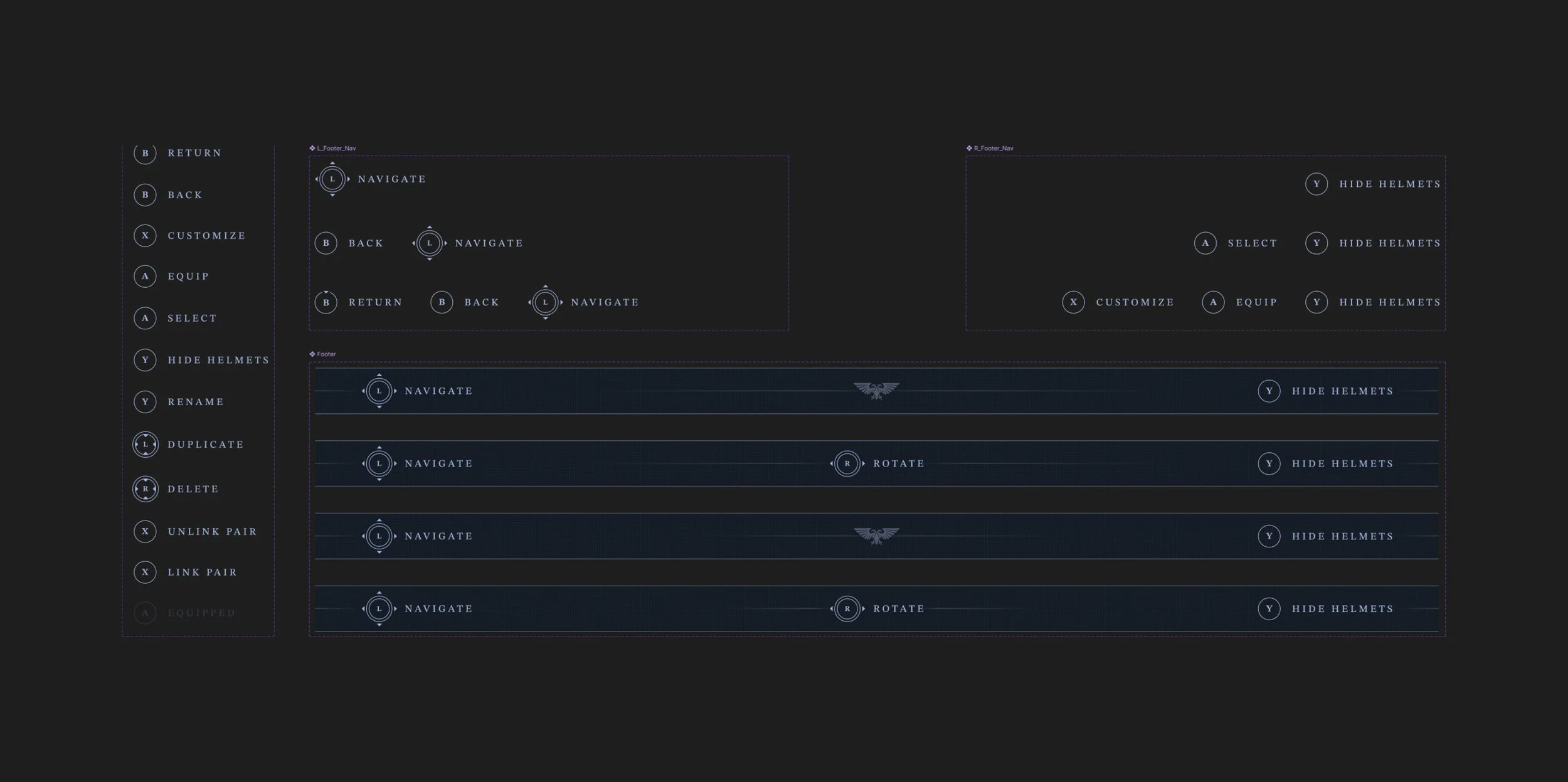
(P1) The button and symbol components, assembled into a miniature design system.
(P2) The buttons and footer were assembled as dynamic components with flexible drop-downs to quickly change configurations.
Final Visual Frames:
The final frames integrate the refined design system, offering a seamless interface where tactical options and customization come together. With clear visual hierarchy and Warhammer-inspired textural patterns, each screen supports the intent of the feature while ensuring ease of navigation.
BONUS FRAMES
Below are some initial frames where some of the above design thinking began before being tabled and structured into the above feature. These are just for fun.


