EARLY CONCEPTS
Working with rough wires to start, I approached the feature by creating vision frames that could explore the nuance of Infinite’s Customization experience. Working hand in hand with UX, we continued to iterate upon the wireframes and the experience design until we landed on an updated flow and clear vision of the feature’s realization and visual design language.
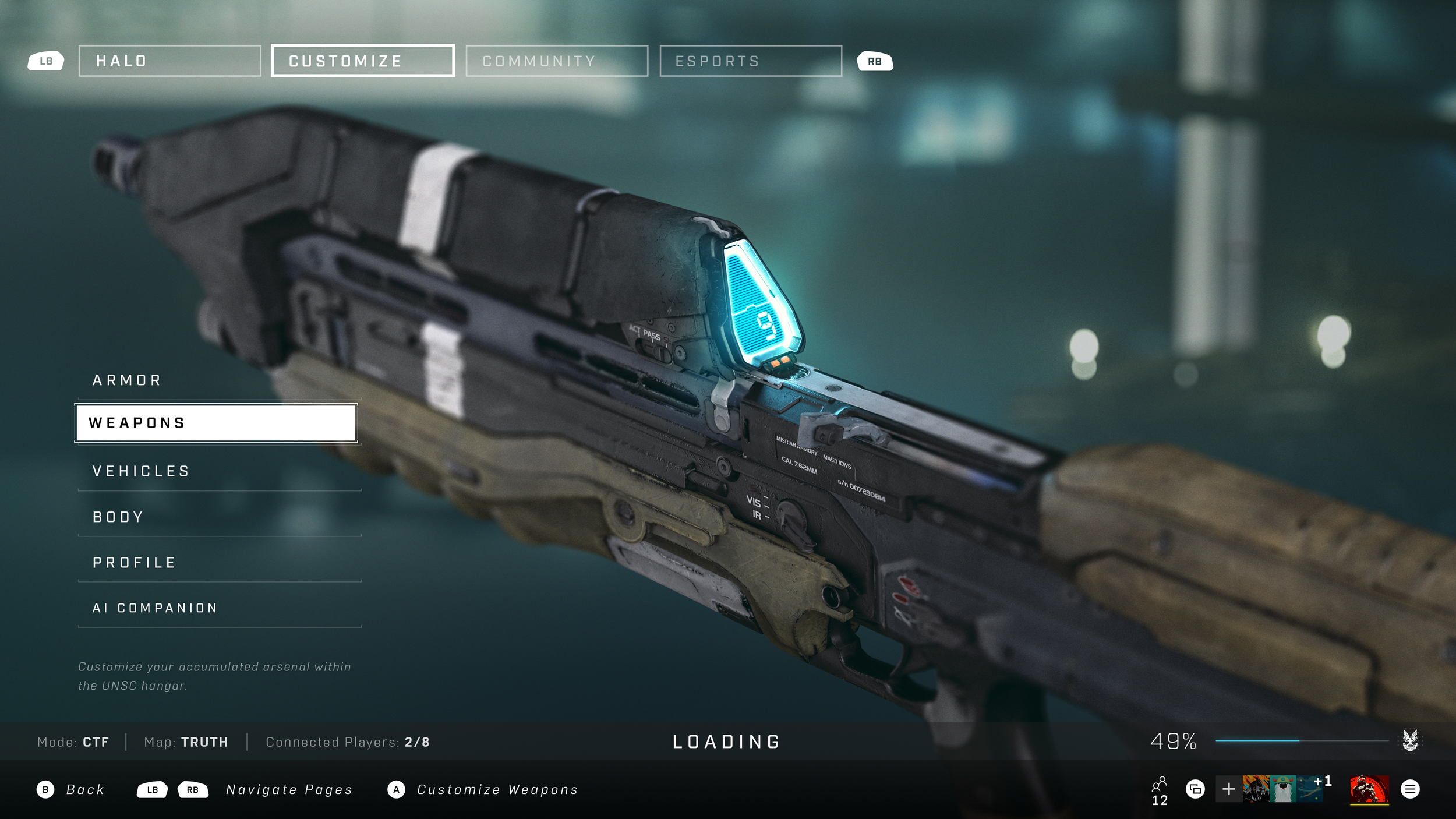
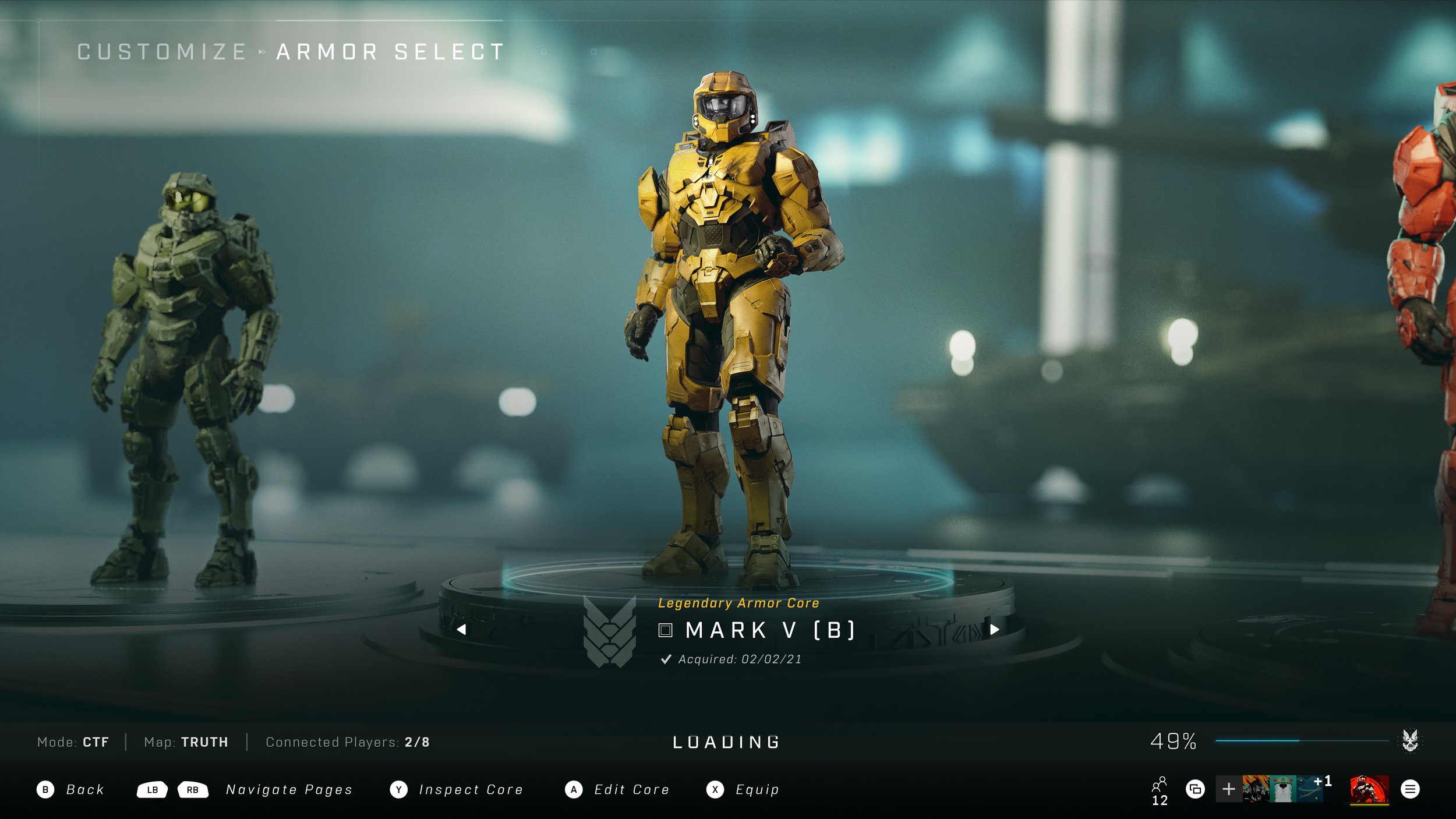
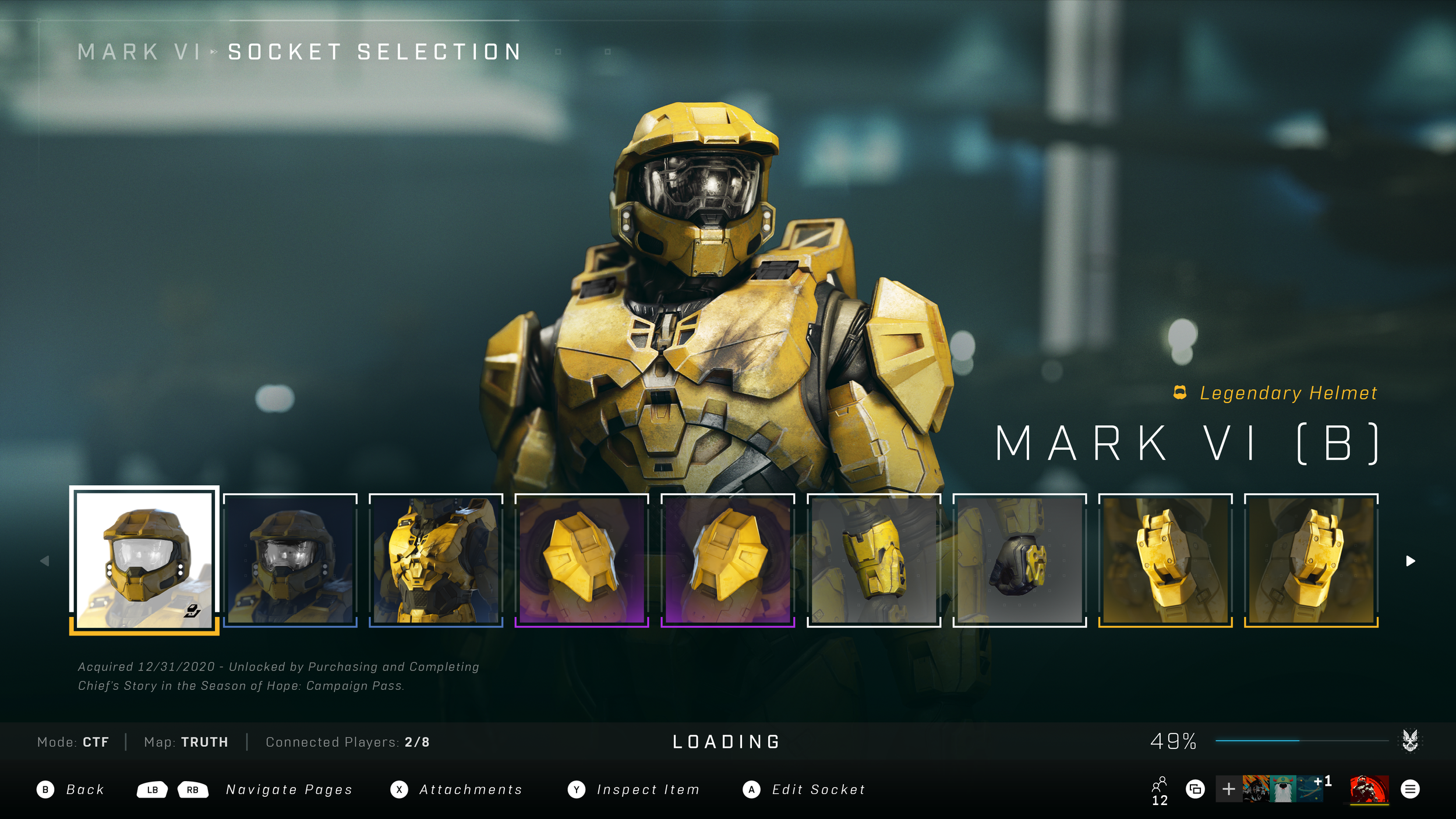
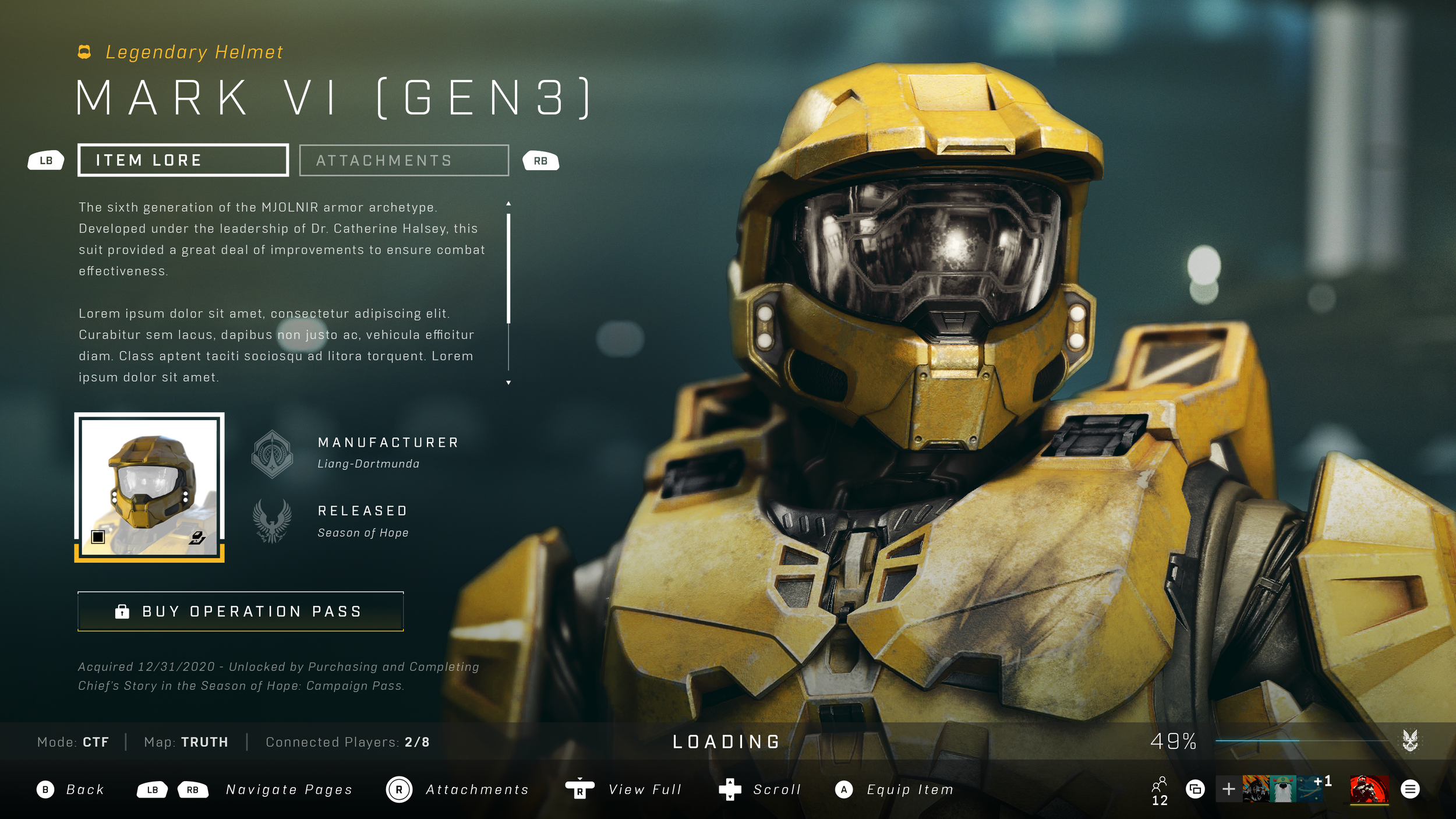
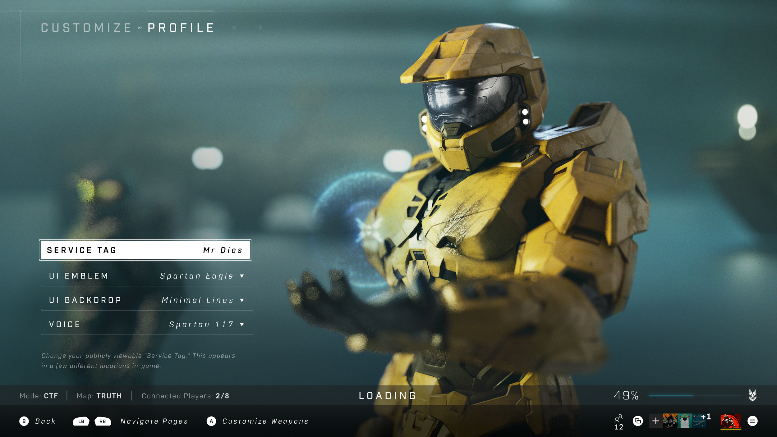
REALIZATION PREVIS
Once aligned with stakeholders, I worked within various 3D, animation, and editing tools to design the experience’s realization and camera systems for each branch of Customization. The output of this exercise became my primary target in providing direction for our internal and external development partners. Over the course of the project, I worked with numerous teams to help author an abundance of original tech to flesh out what would eventually become the most robust, code-driven Customization experience of the franchise to date.
REALIZATION
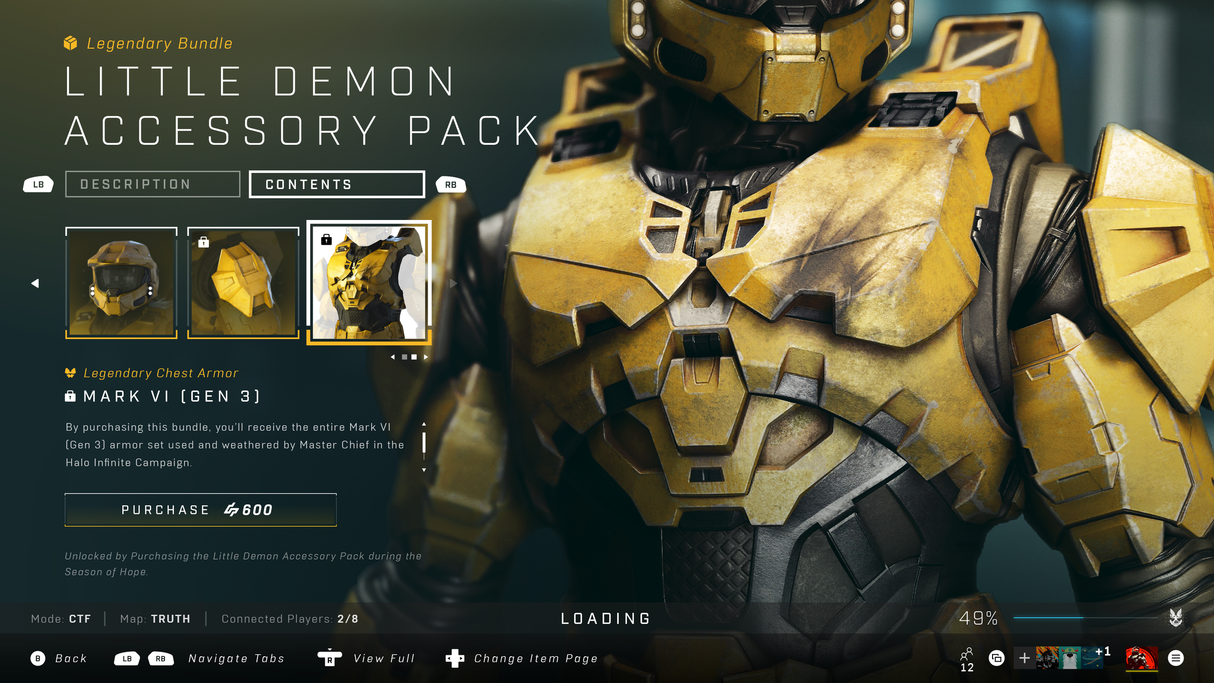
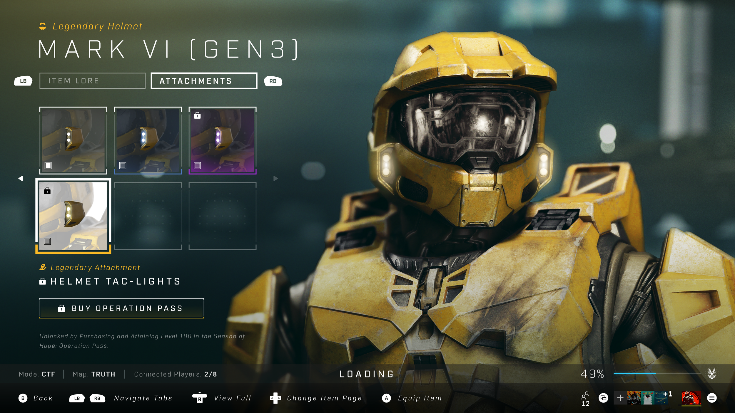
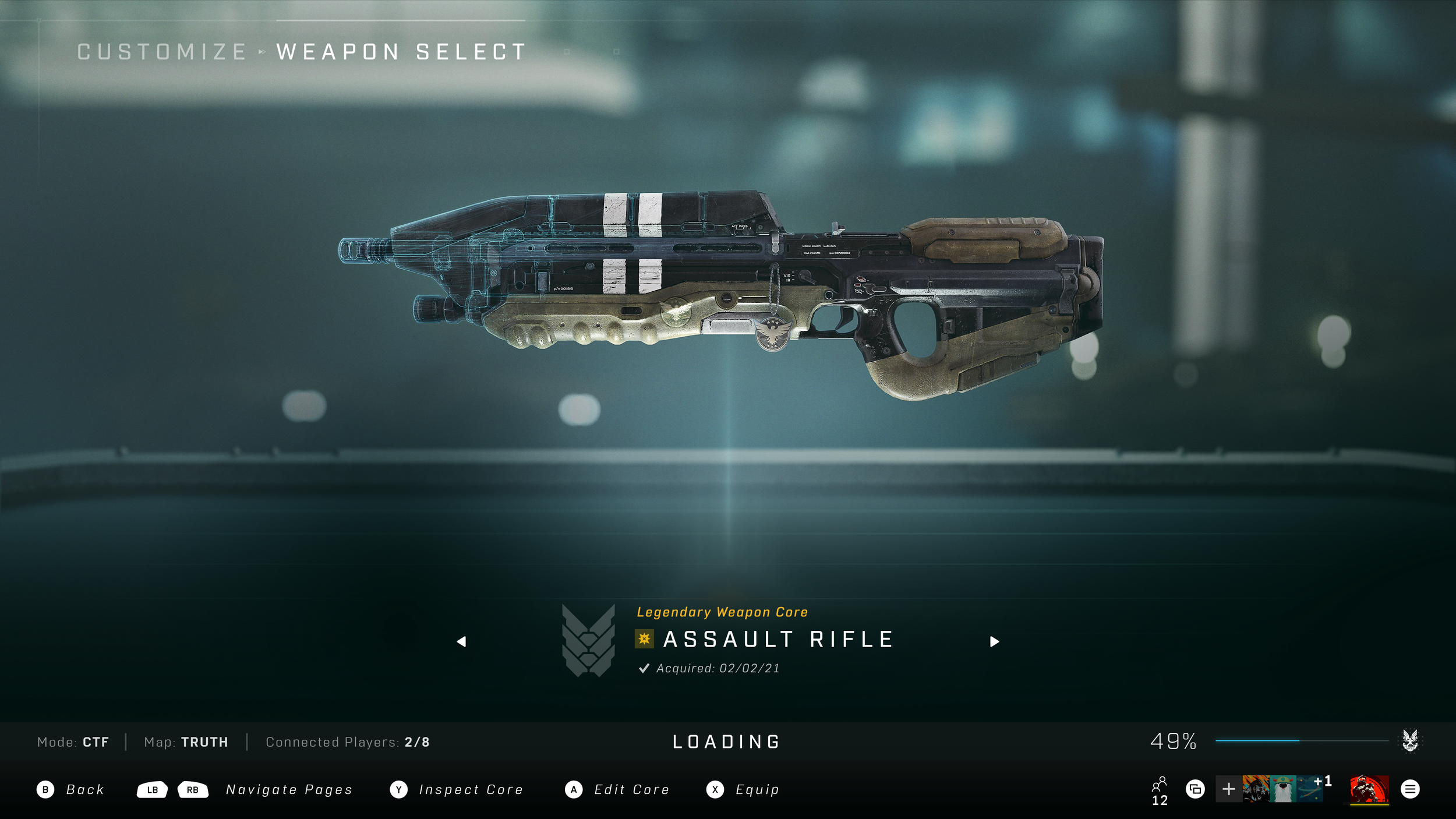
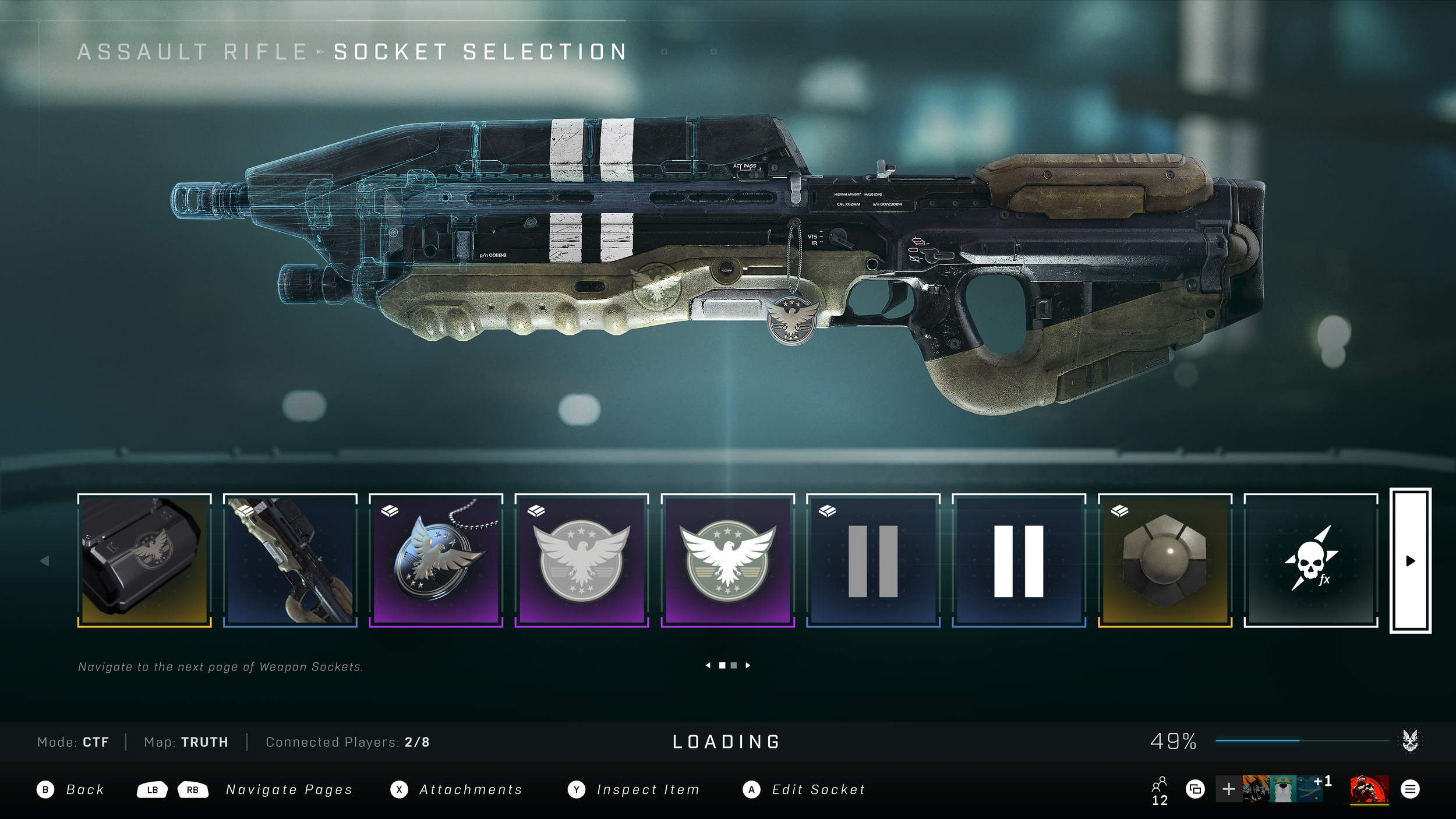
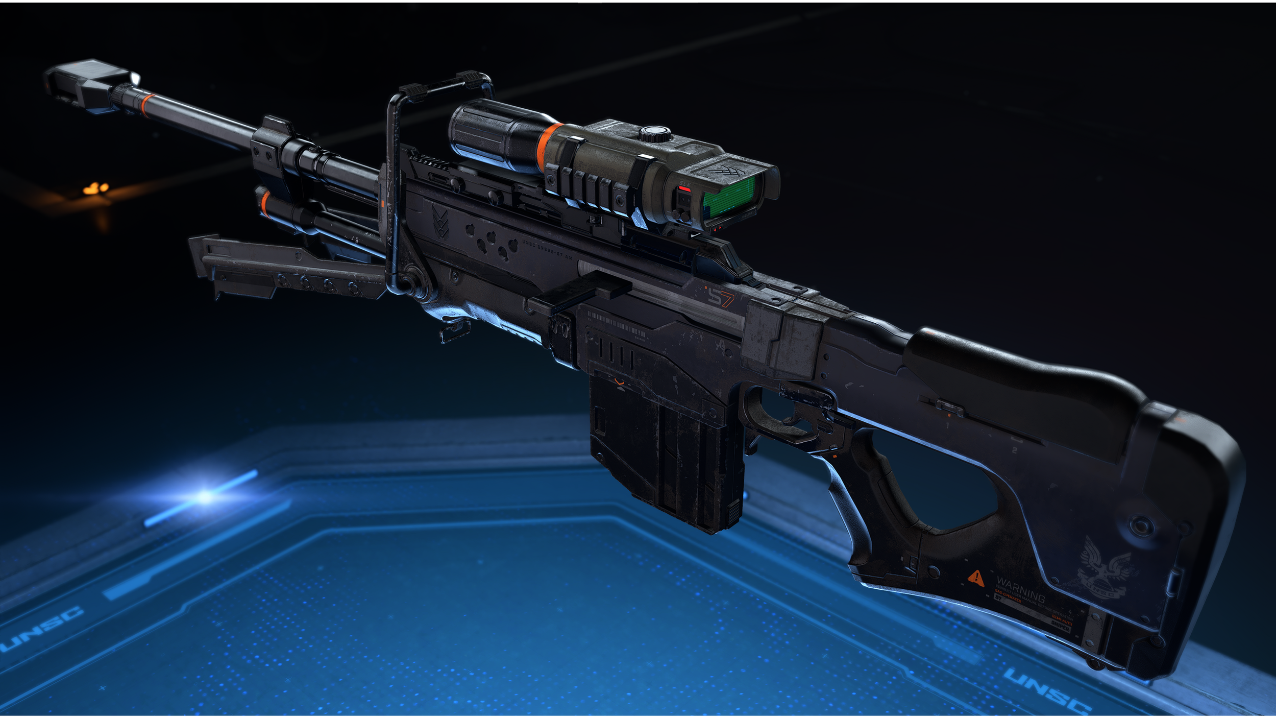
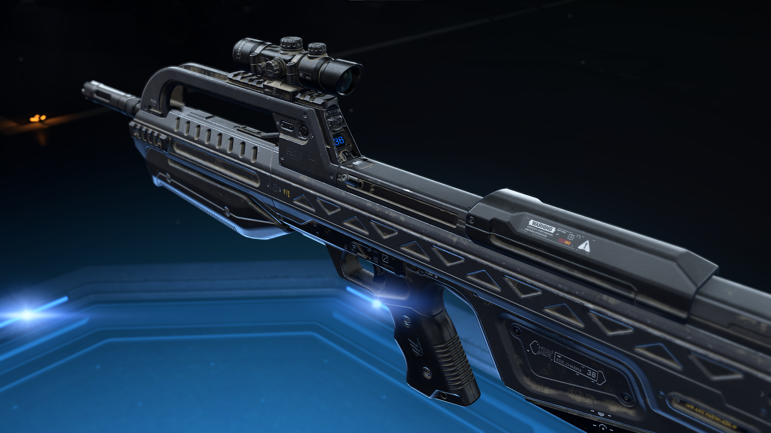
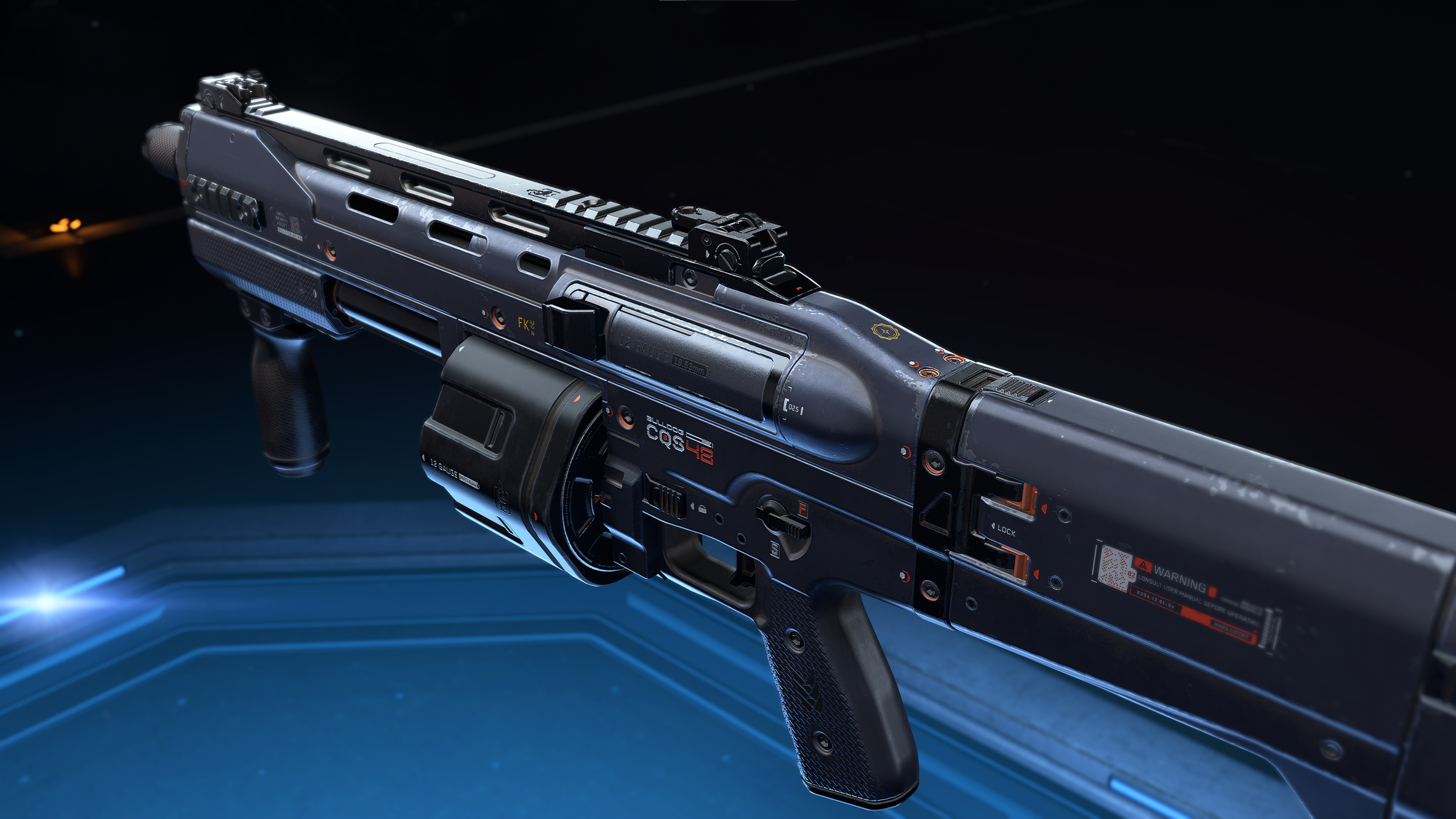
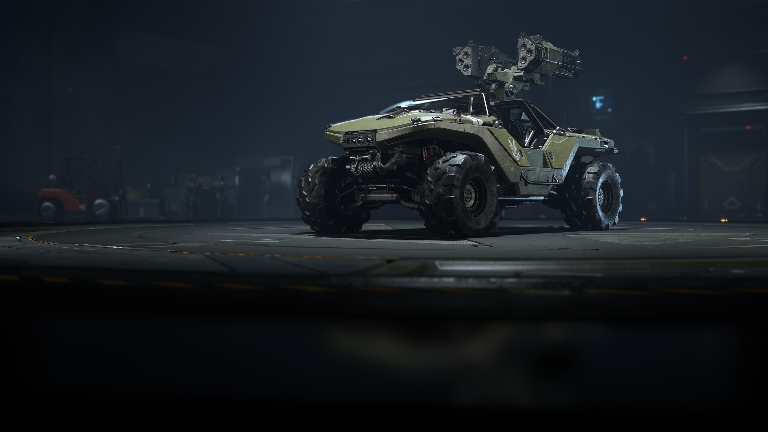
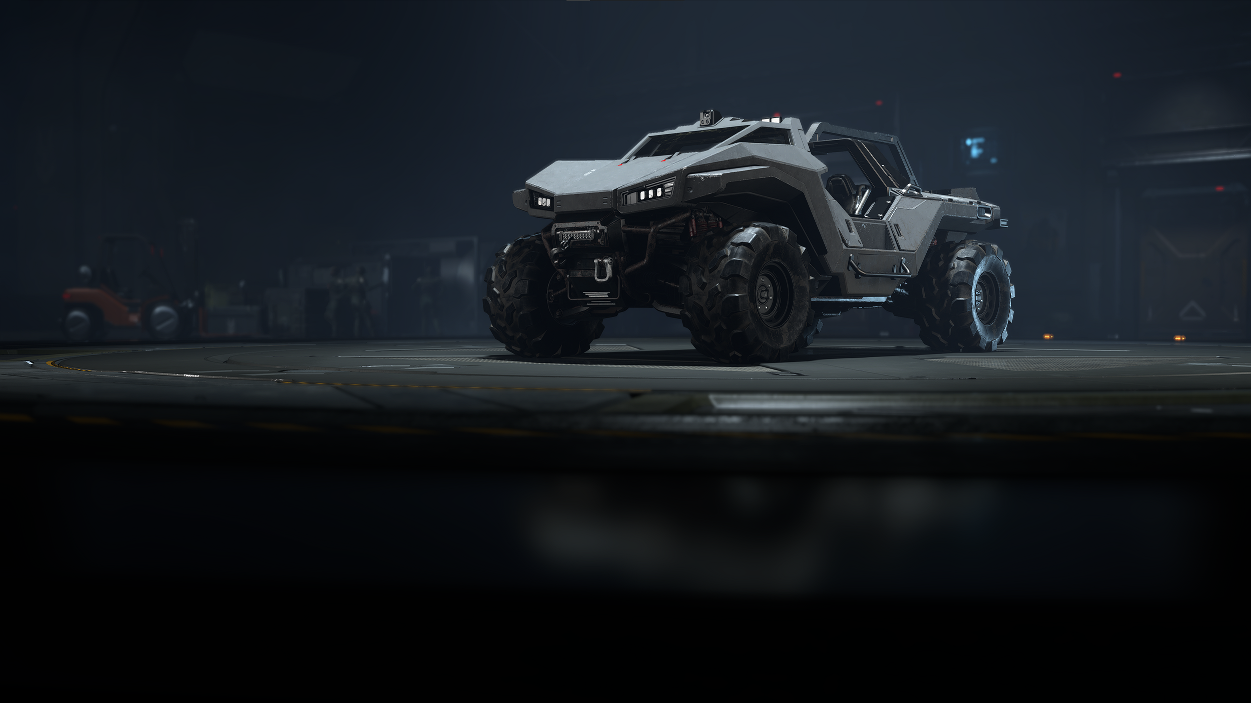
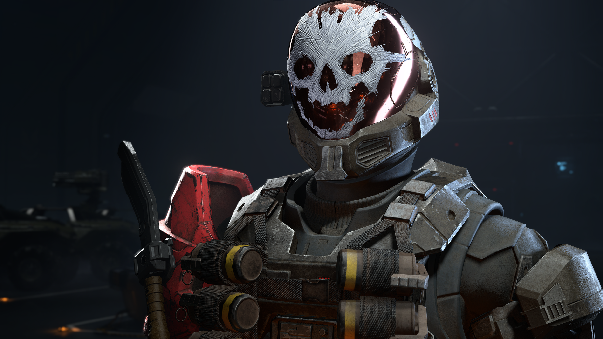
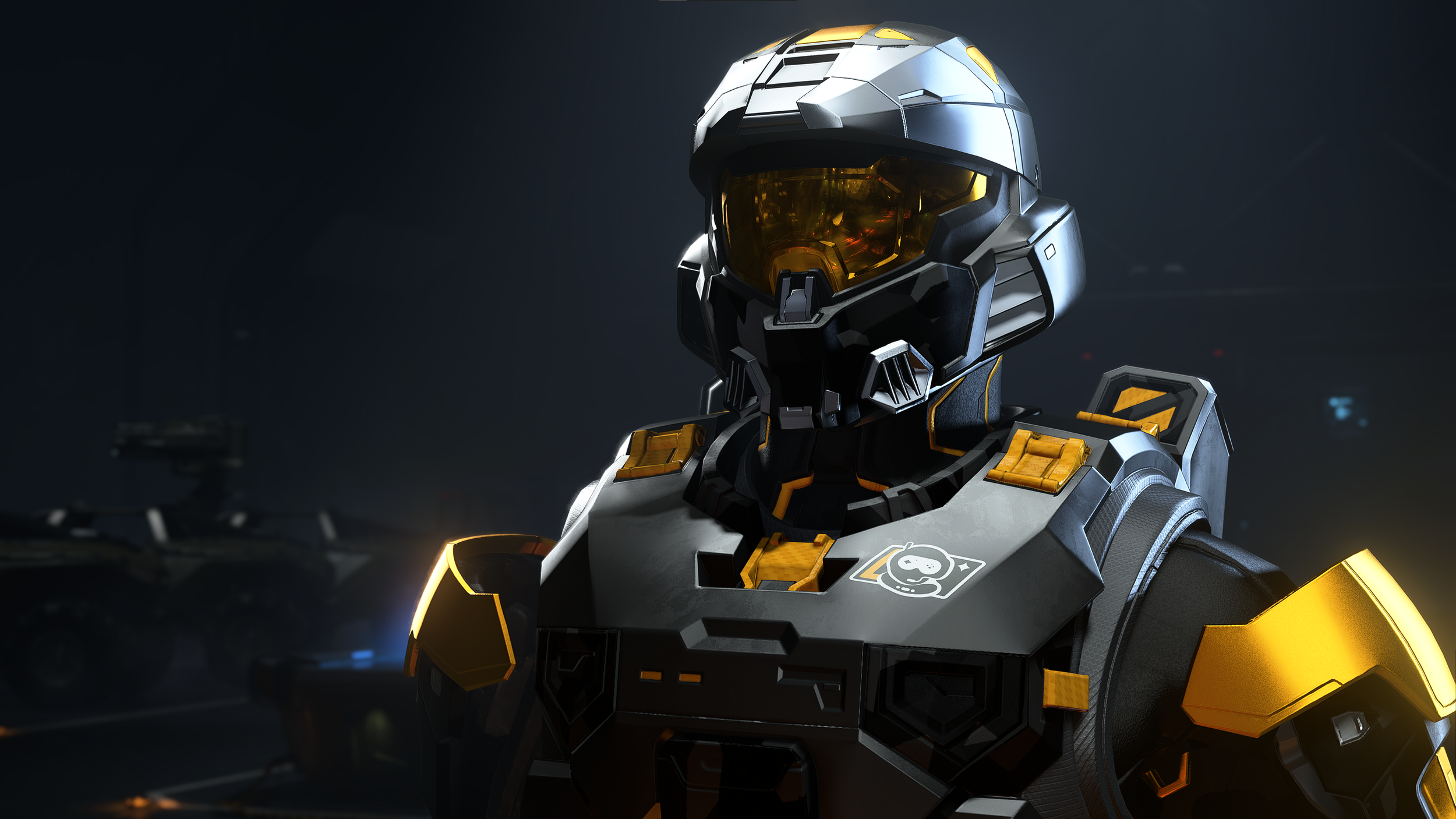
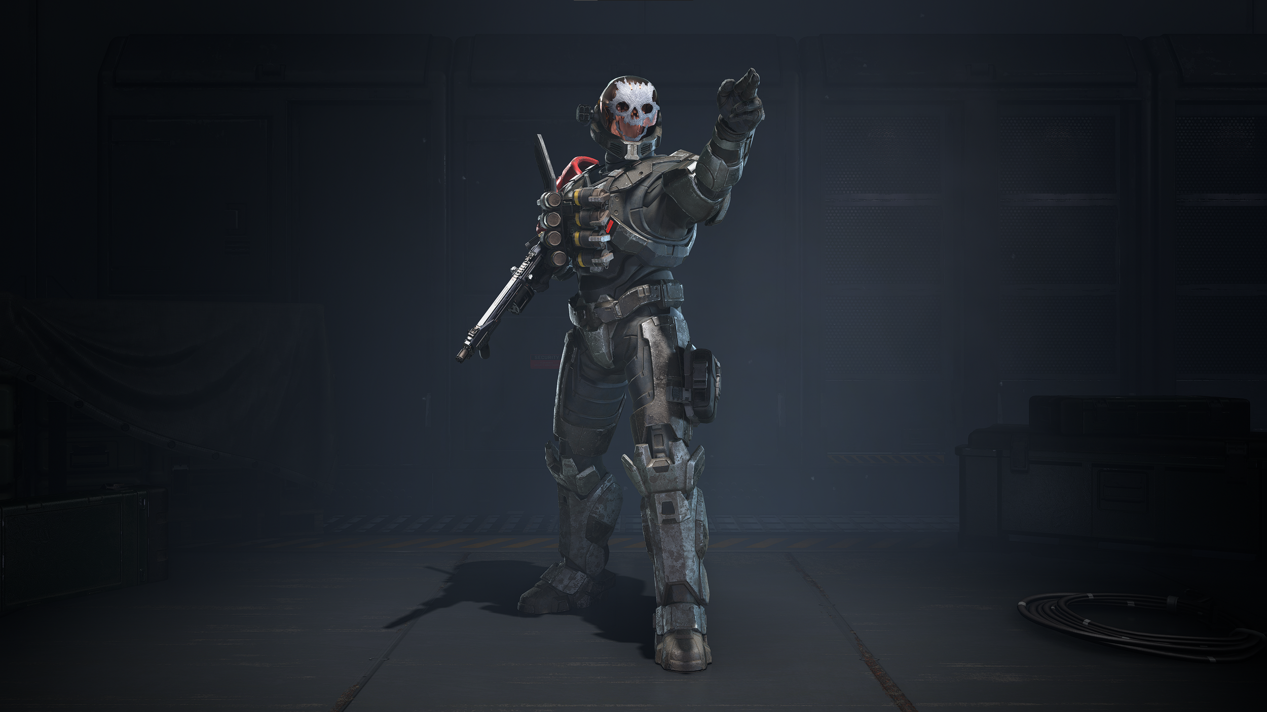
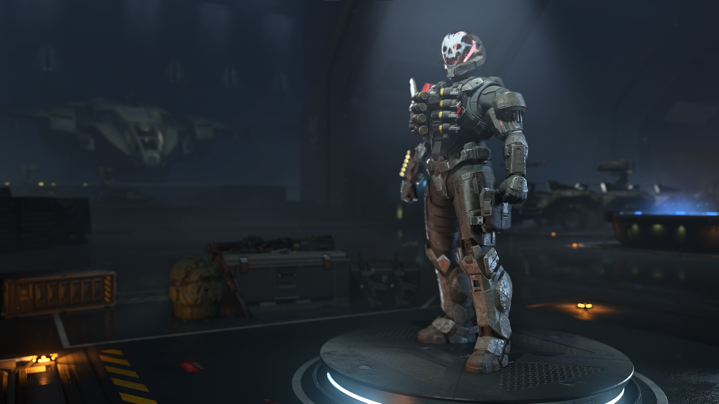
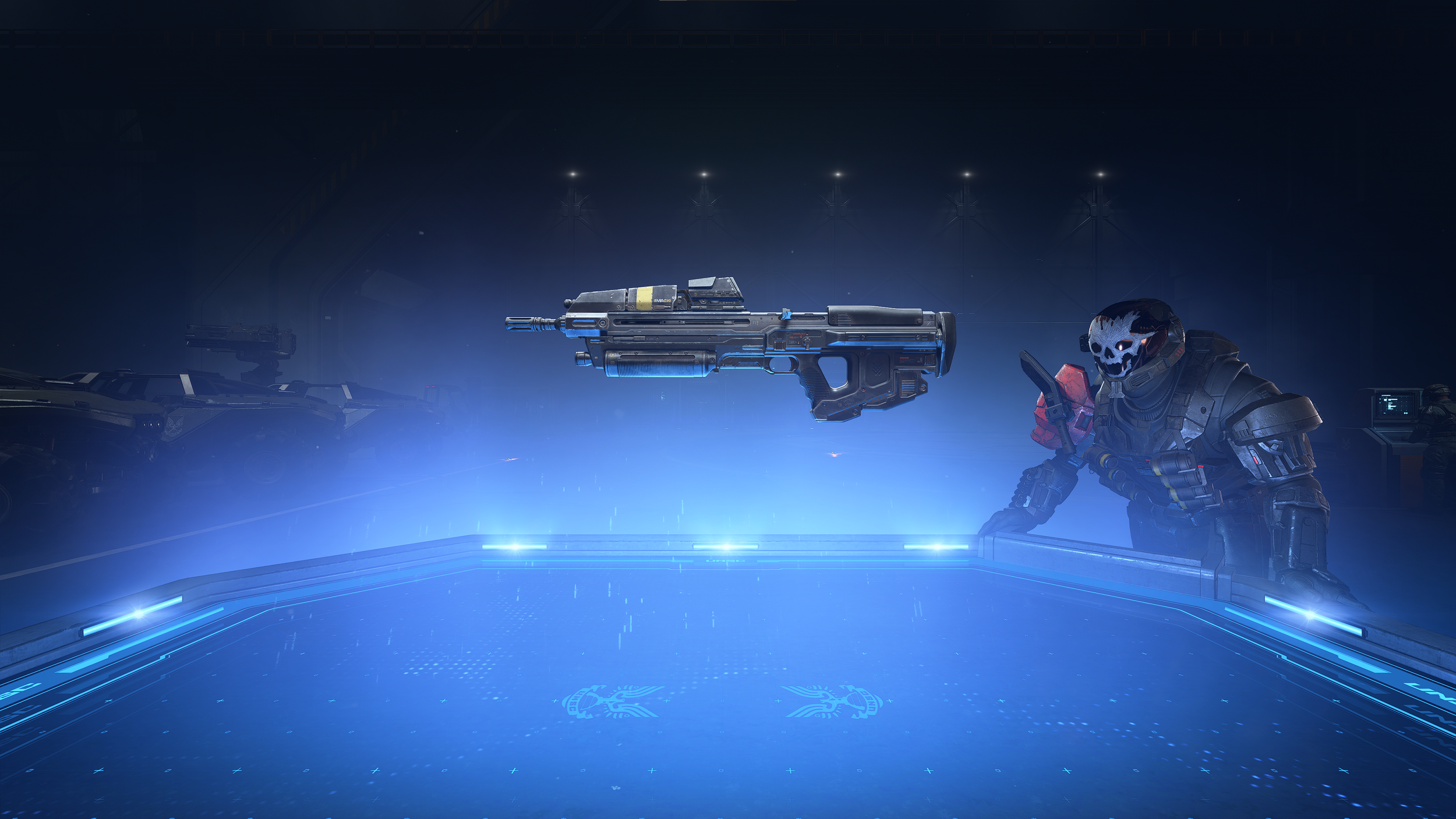
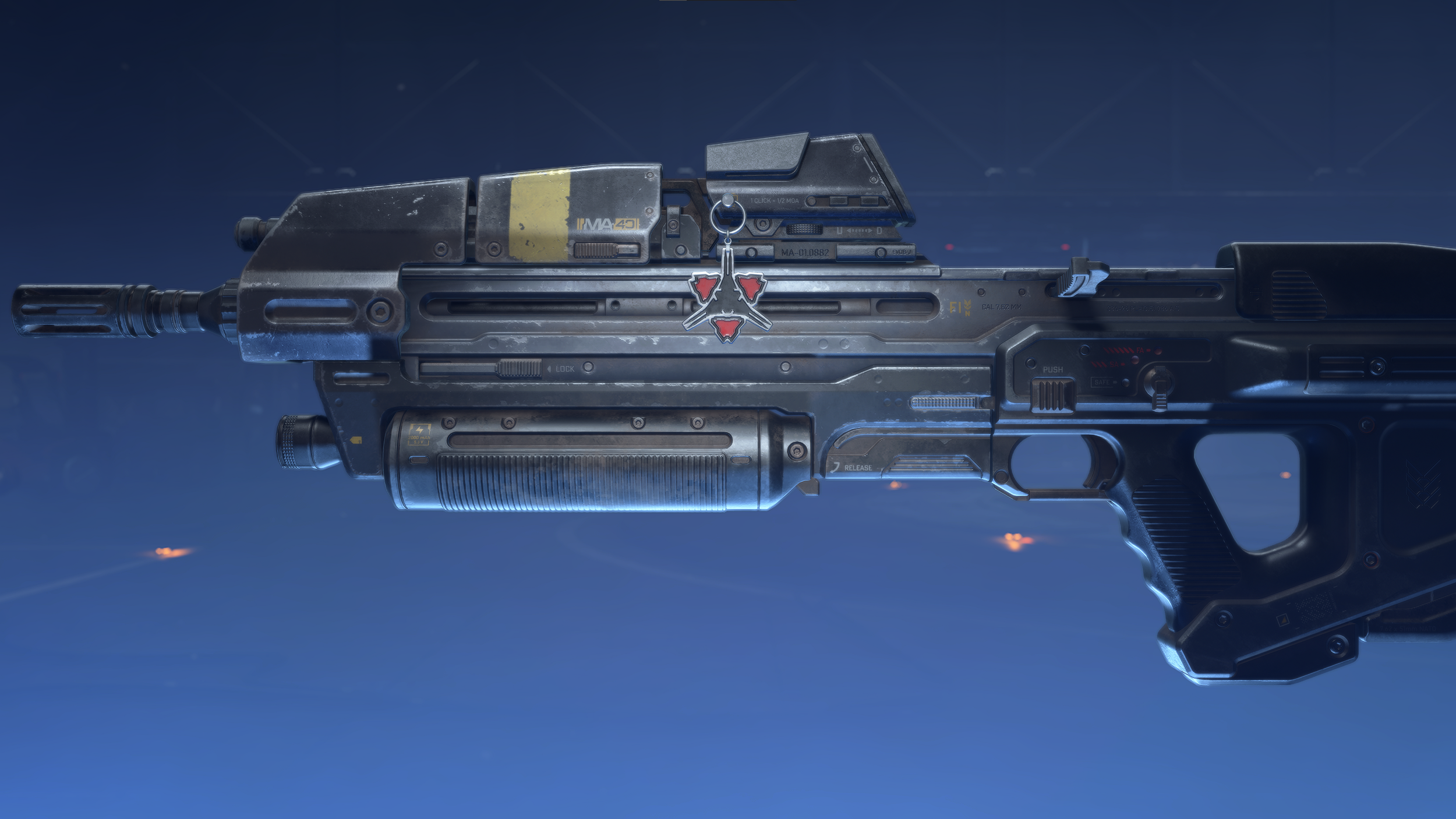
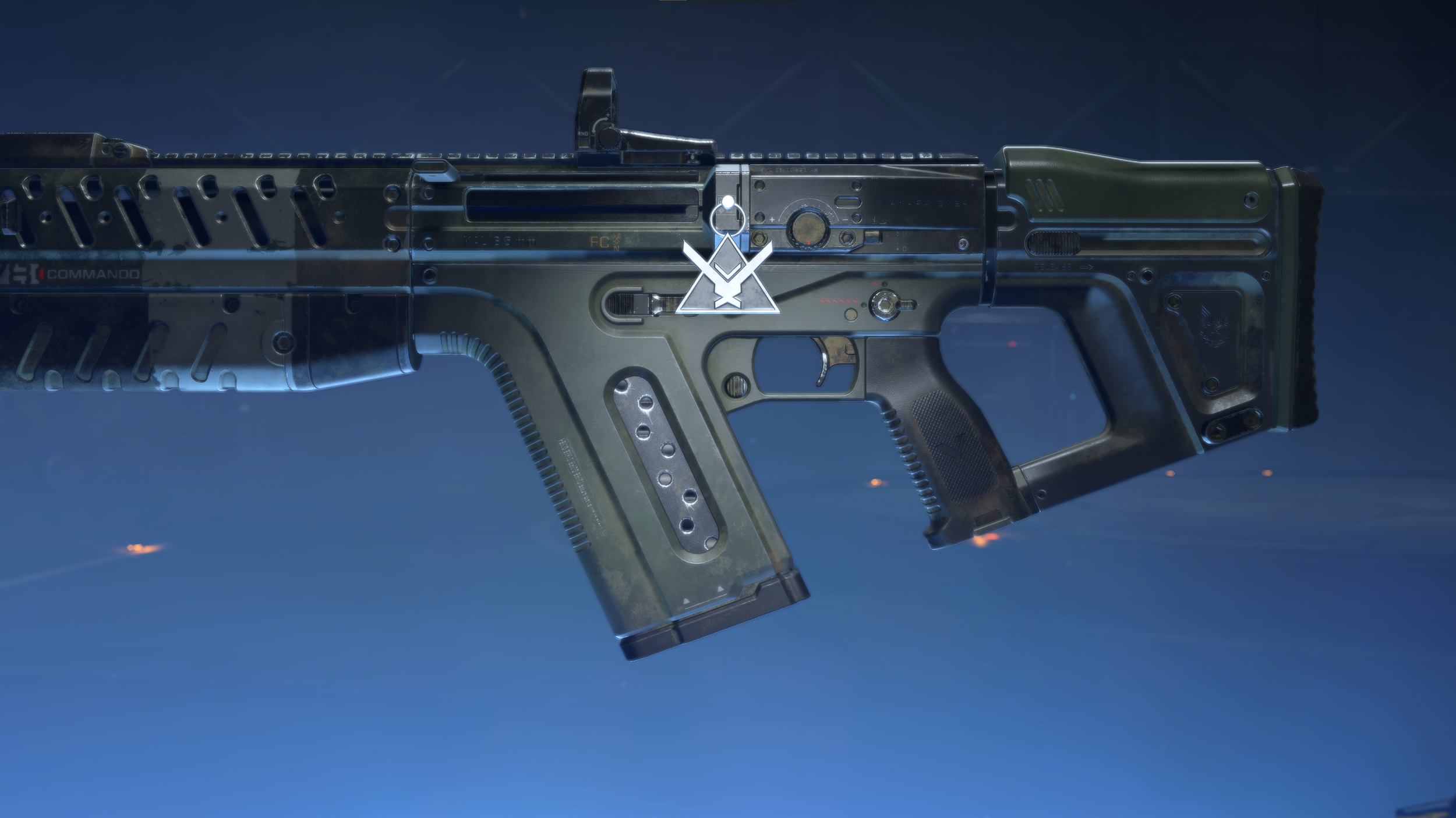
Leveraging the previsualization seen above, we reached out to one of our co-development studios to partner on building out a code-based, dynamic camera system. This served as the foundation of the space in which we would ground the realization of our military-focused Customization Hangar. Creating these dioramas was a highly collaborative, cross discipline exercise between Realization, UX/UI, World Building, Lighting, FX, Development, Animation, and more, but none of this would have been worthwhile without the amazing equipment that was beautifully modeled and textured by our Character, Equipment, and ECT teams. Below are a few UI-less selects of the various spaces I had the opportunity to collaborate on circa Infinite’s initial release.
CREATING AN ECOSYSTEM
Throughout Infinite’s development, I also had the opportunity to co-lead the team who were tackling the design aspects of our Waypoint Web and Companion App experiences. This helped provide opportunities to extend the in-game design and align Infinite and Waypoint’s Customization features consistently in both interaction and visual design philosophies. These first steps were foundational in building out the larger customization ecosystem for the community to enjoy.
REDLINE EXAMPLES
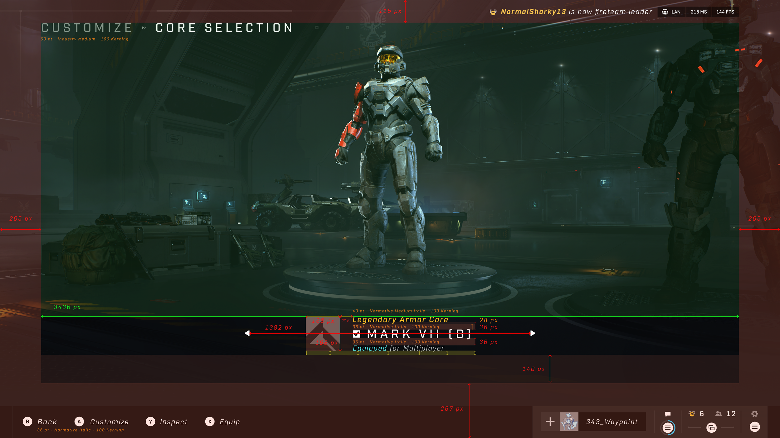
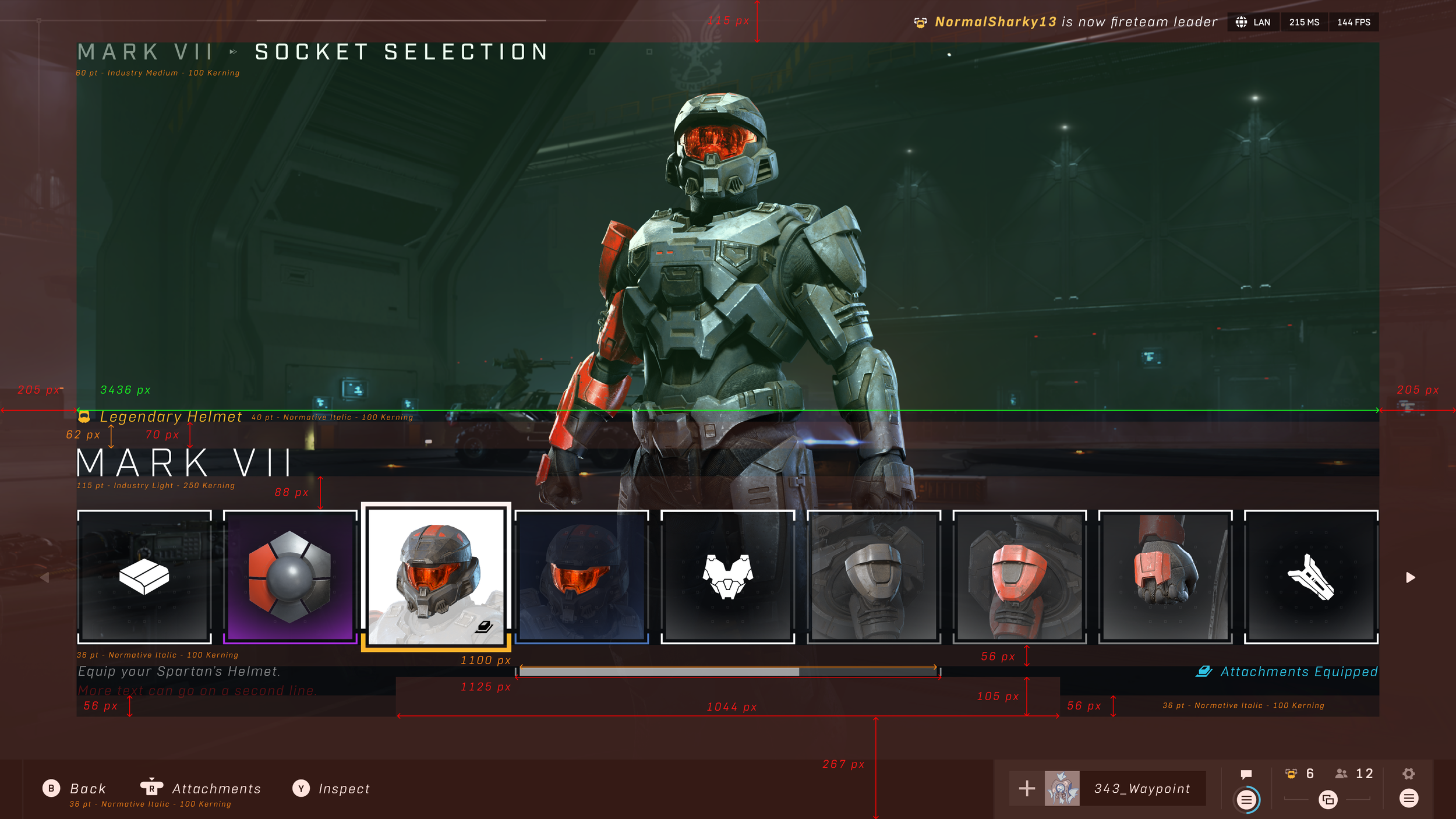
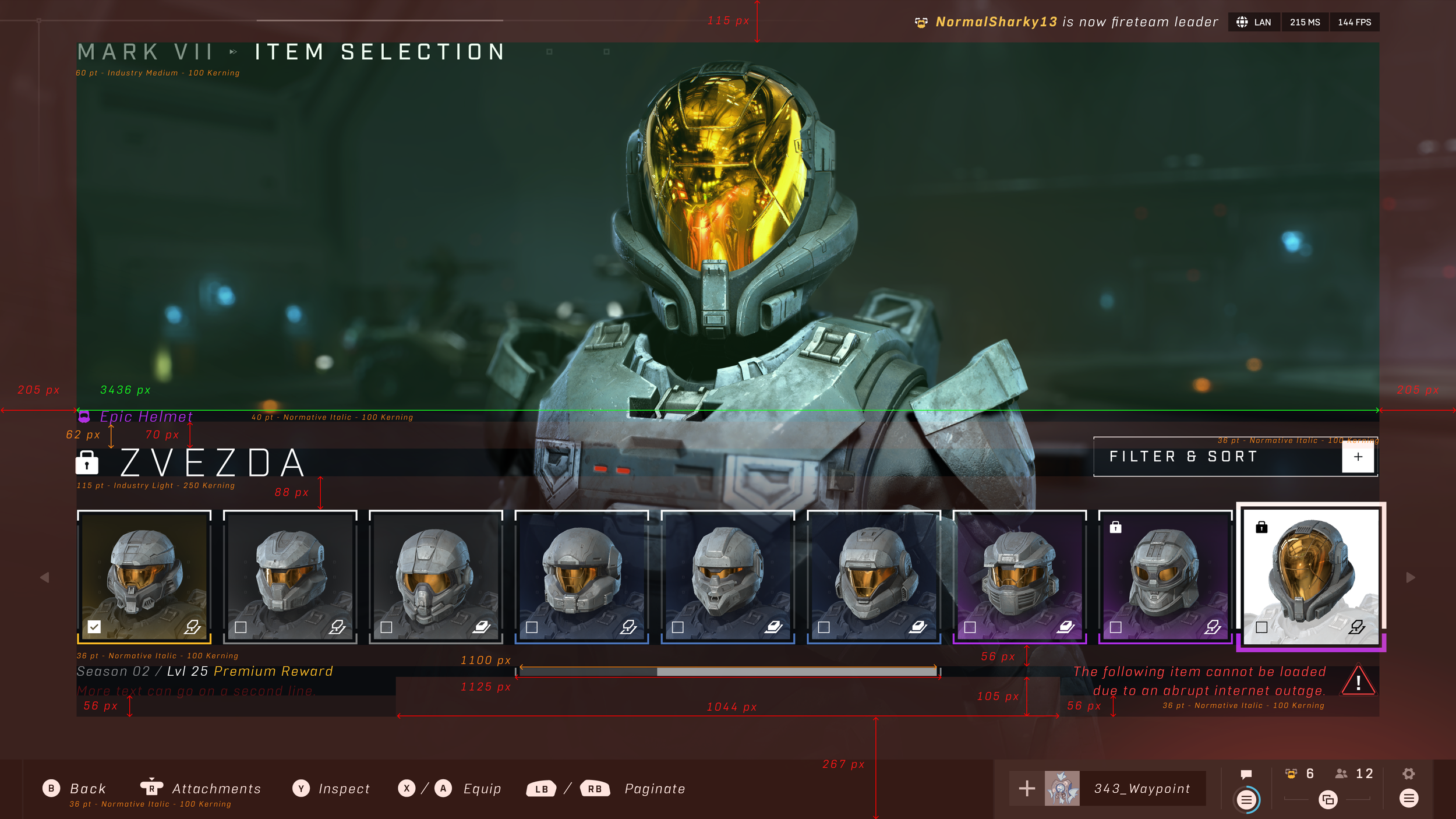
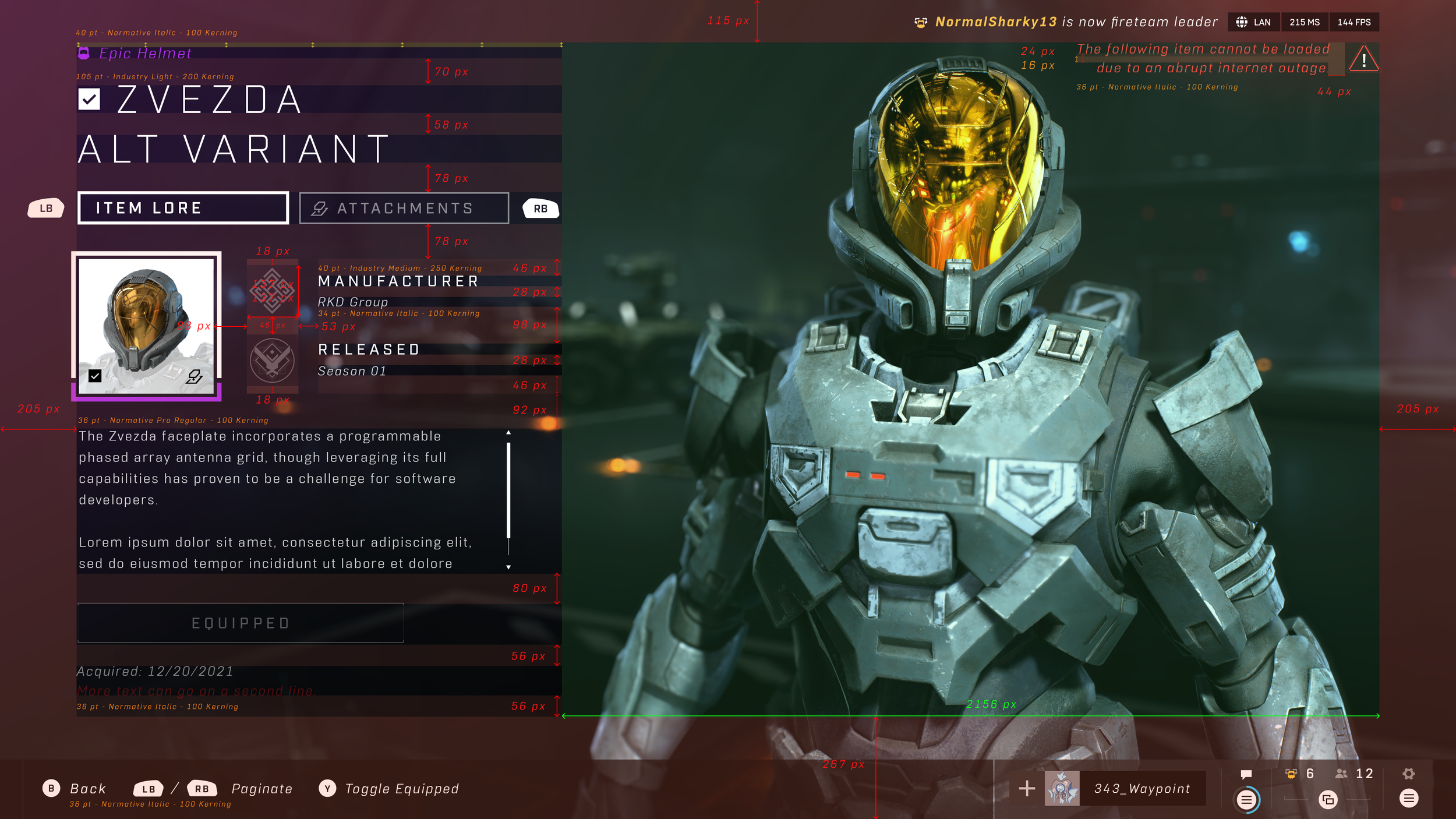
This is a bit of behind the scenes for some, but when it comes to the final UI, we create blueprint-like instructions for our development and implementation partners to drive clarity and quality. These were a few selects of the redlines that were created based on the final designs.
FINAL UI + REALIZATION
Once it all came together, we were left with the visuals below. For some additional context and process, the team and I collaboratively discussed production of a variety of different aspects of Infinite’s Visual Design and Realization in our “Inside Infinite” series that we had created leading up to launch.


